

Project: Strategic redesign proposal for the local furniture store “Bodega del Mueble” e-commerce platform.
Objective: To elevate the brand perception to “premium” and redesign the shopping experience to justify higher prices, attracting a more aspirational client.
The goal was not just an aesthetic change, but a complete transformation of the user experience.
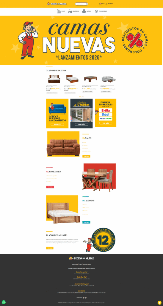
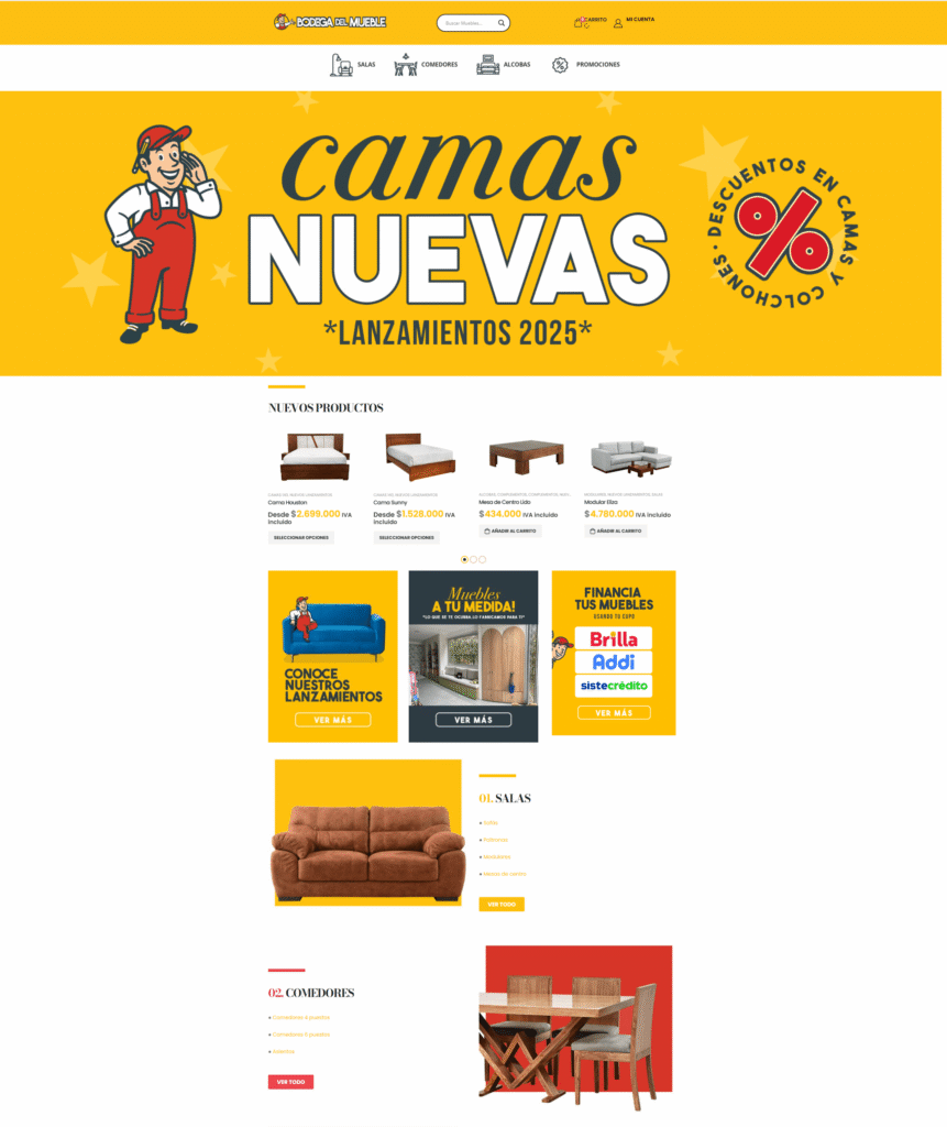
Before
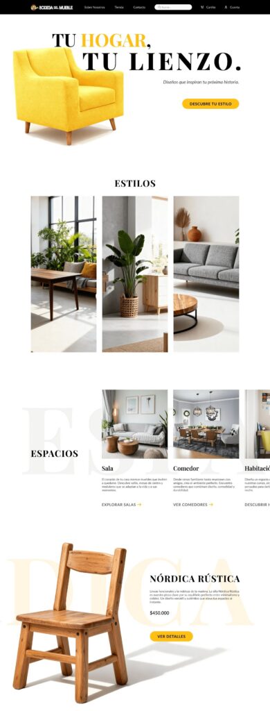
After

The Diagnosis: Identifying Friction Points
An analysis (audit) of the existing site revealed 5 key problems holding the brand back:
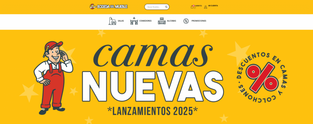
1. Visual Inconsistency:
- Chromatic Conflict: The red and yellow colors competed for attention, confusing the user about which elements were interactive.

- Mixed Graphic Styles: The site blended flat vector icons with others attempting to simulate realism, breaking brand consistency.
- Excessive Typography: 3 different fonts were detected, creating visual clutter.
2. Low Legibility and Visual Fatigue:
- Poor Contrast: The combination of yellow text on white backgrounds made reading difficult, especially for users with vision problems.
- Overuse of Yellow: The main color was used in such large blocks that it caused visual fatigue, instead of guiding action.
3. Poor Hierarchy and Spacing:
Sections were visually “stuck together” without negative space. This created a sense of disorder and made content scanning difficult.
4. Interrupted Purchase Flow (UX):
The site had a critical friction point: upon adding a product to the cart, it sent the user directly to the checkout. This completely broke the buying flow and prevented further exploration.
5. Poor Navigation and Absent Filters:
The shop page lacked essential filters (like price, material, or style), making it impossible to find specific products. The search function was also ineffective.
The Solution: An Editorial and Premium Experience
To solve these problems, my proposal was based on a clear concept: transforming the store into a digital design magazine.
My design strategy focused on:
Concept: Creating an aspirational and immersive experience. The focus would shift from “selling products” to “inspiring lifestyles,” allowing the user to dream and plan their spaces.
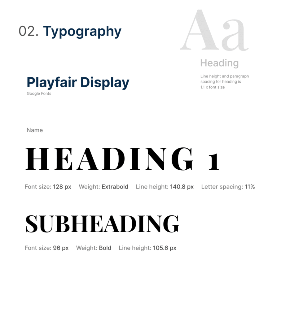
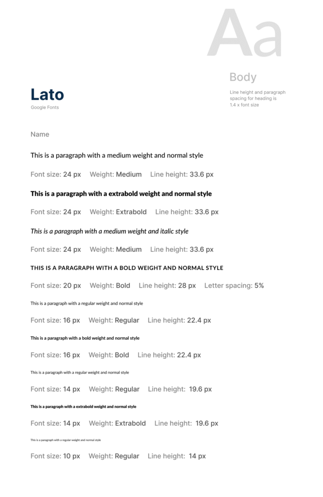
Typography: I defined an elegant combination: Playfair Display (Serif) for titles, evoking an editorial style, and Lato (Sans-serif) for body text, ensuring impeccable legibility.
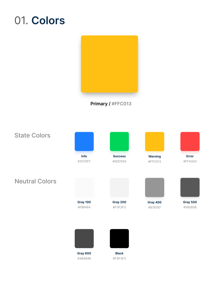
Color Palette: I proposed using yellow strategically: only for key interaction elements (buttons, hovers, icons). The rest of the palette would be built on sophisticated neutrals (grays, off-white) to give prominence to high-quality photographs.
Layout: I implemented an asymmetrical design with extensive use of negative space. This not only creates the “premium” feeling but directs the user’s gaze to focal points.
My Design Process
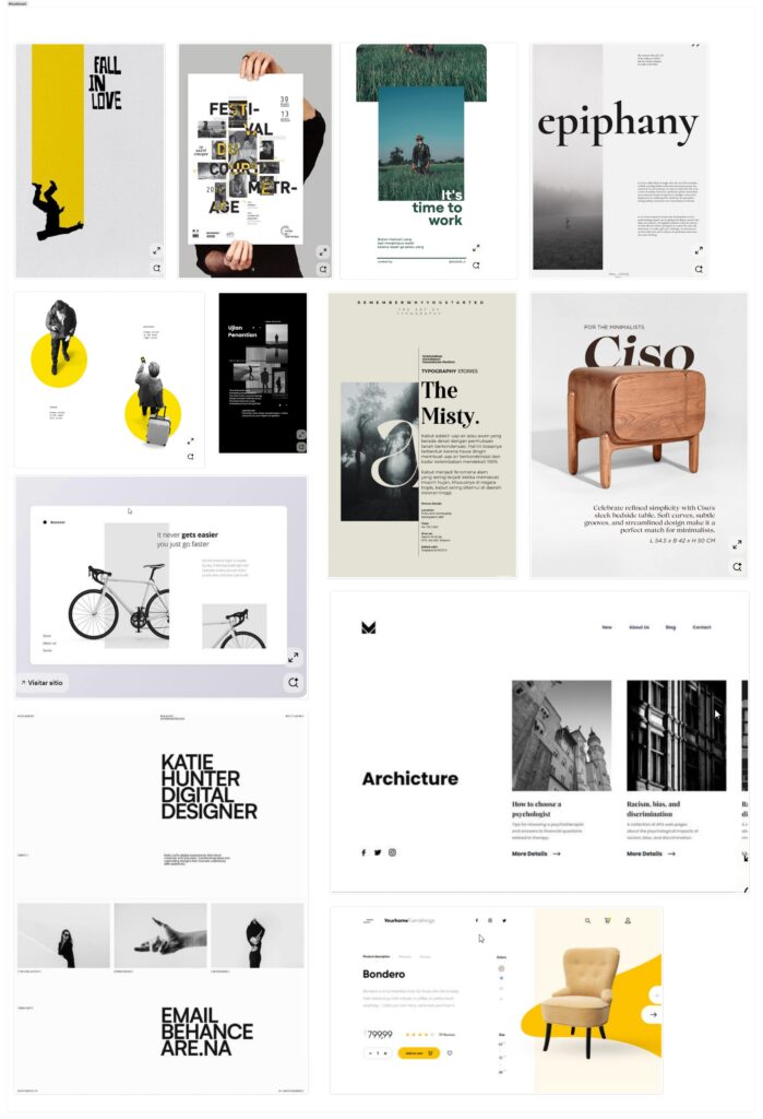
1- Visual Direction: The Moodboard:
The moodboard was key to defining the new atmosphere. I focused on how negative space acts as a design element itself, allowing the products to stand out. The overlap of texts and images, along with the subtle use of yellow as an accent, were the foundation for the editorial look.
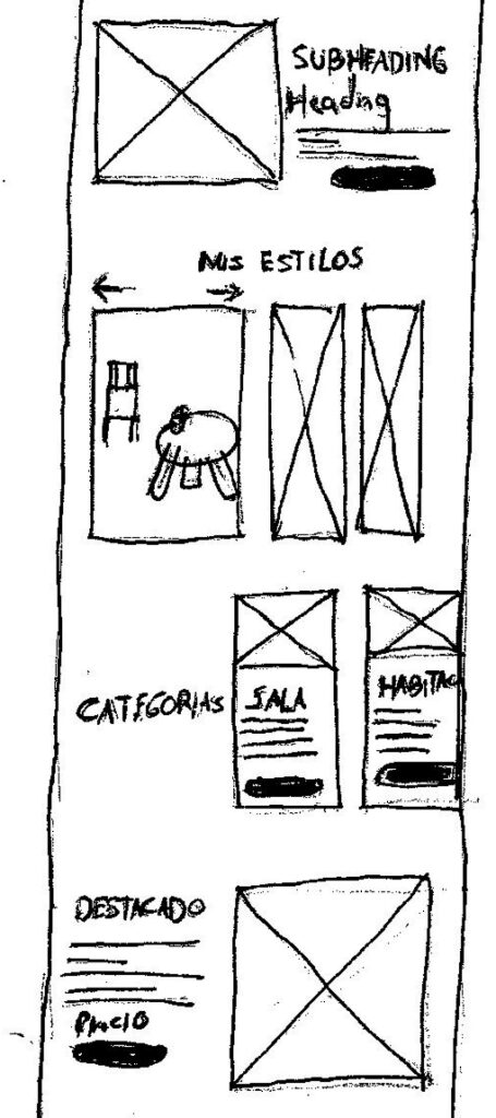
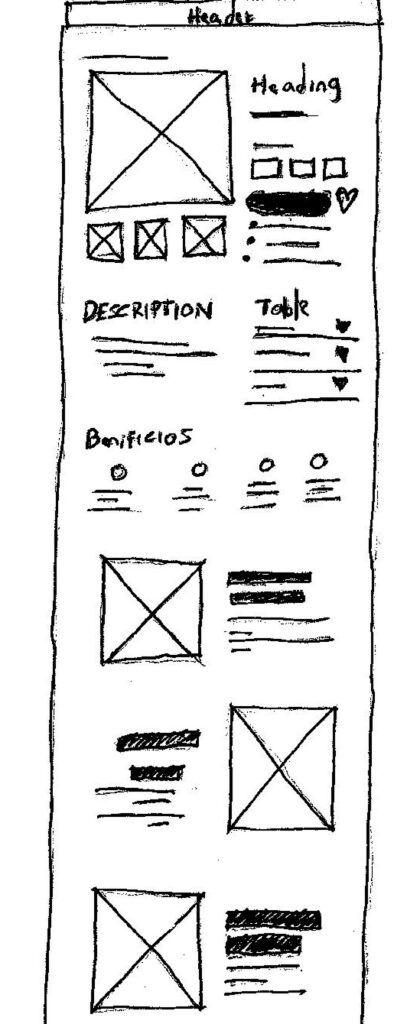
2- Structure and Sketches: The Wireframes
Based on the moodboard, I explored the structure of the key pages:
Wireframe (Homepage): I played with large typography and images to evoke the magazine style. I explored a “My Styles” section where a card expands on hover, allowing the user to explore products in a complete composition and encouraging the purchase of sets.
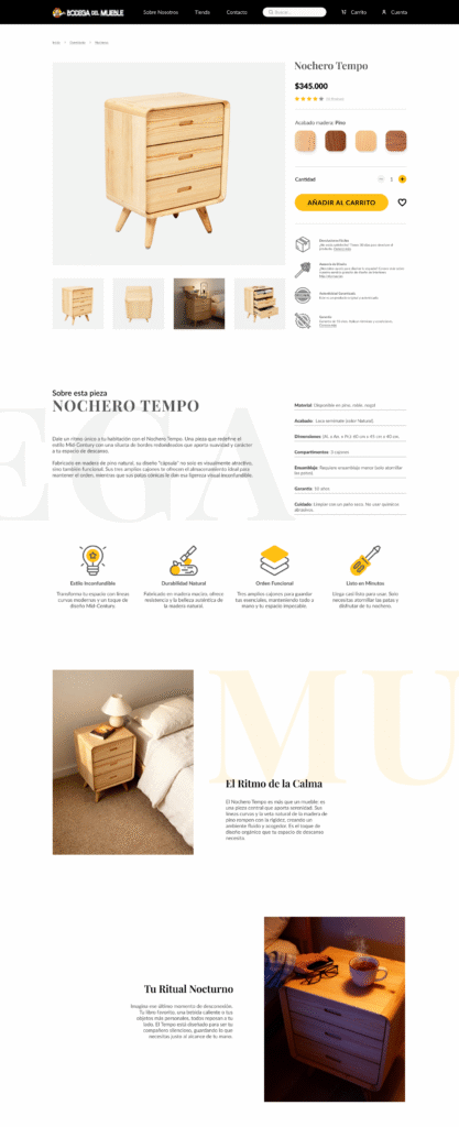
Wireframe (Product Page): In addition to the standard product gallery, I designed lower sections to tell a story about the furniture, its benefits, and materials. The goal was to connect with the aspirational user and justify the product’s value.
Redesign
This is how the strategy and wireframes came to life to solve the diagnosis problems:
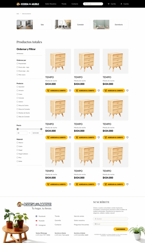
1. Shop Page and Navigation
To solve the “poor navigation,” I designed and implemented a shop page with a clear and powerful filtering system (price, material, style), allowing the user to find exactly what they are looking for.
Shop page
2- Homepage and Product Page
The final design applies the asymmetrical layout, the refined color palette, and the new typographic hierarchy to create the premium feel we sought from the beginning.
Old Homepage
New Homepage
Old Single Product Page
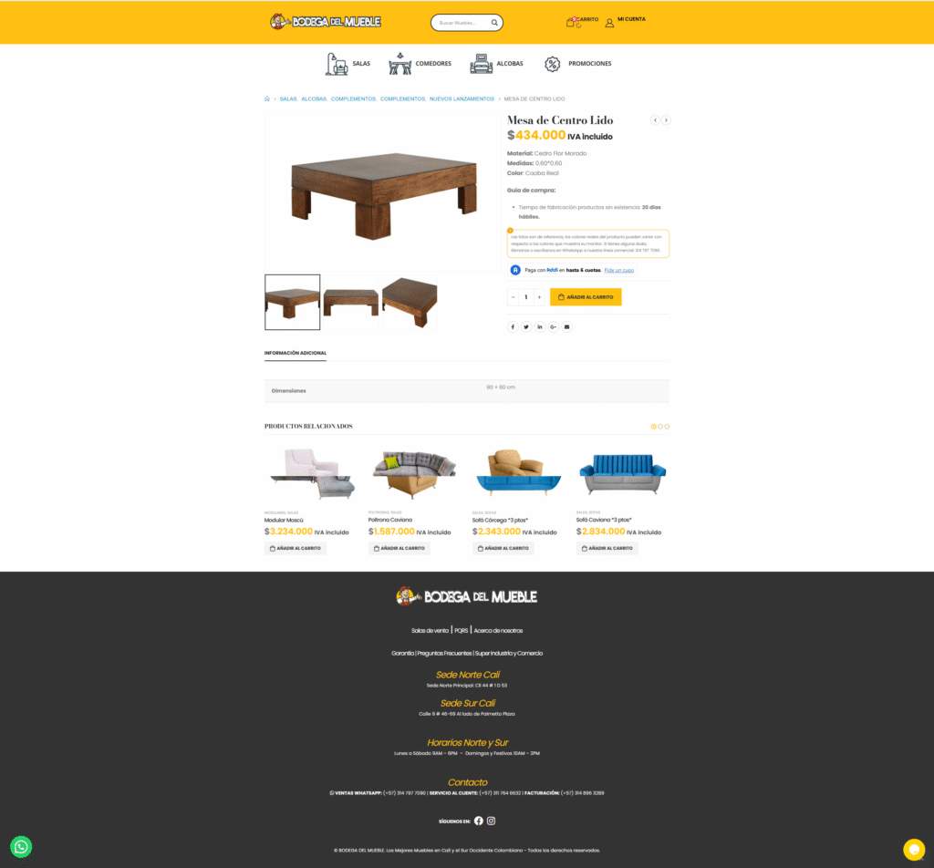
New Single Product Page
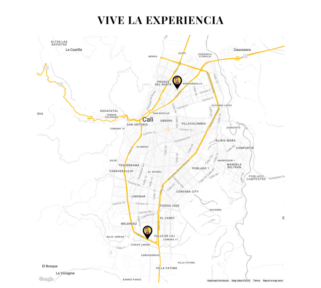
3- Brand Details
Finally, I unified visual elements such as the location map, creating a personalized version with the brand’s colors that feels integrated into the experience.
Results
The following key results are expected:
- Increase in Perceived Value and Price Justification: The new “editorial” and “aspirational” design, along with the use of a premium layout and high-quality photography, is designed to elevate brand perception. This allows the company to align with a more aspirational customer and justify a higher price structure.
- Improvement in Conversion Rate and Reduction in Bounce Rate: The implementation of a robust filter system (by price, material, style) and a real-time search engine directly addresses the problem of “poor navigation.” Users will find products faster, reducing frustration and the bounce rate on the shop page, leading to a higher conversion rate.
- Greater Accessibility and Professionalism: By correcting critical contrast problems (yellow on white) and reducing visual fatigue, the site becomes more accessible and legible. This not only expands the audience but reinforces the brand’s confidence and professionalism.
- Long-Term Brand Efficiency and Consistency: The creation of a unified design system and the technical implementation in a CMS ensure brand consistency for the future. The client will be able to manage and scale their website without diluting the new “premium” visual identity.